Автоматизируем десктопный gui на python + pywinauto: как подружиться c ms ui automation
Содержание:
Модуль messagebox – стандартные диалоговые окна
Окно выбора «да» или «нет» – askyesno():
from tkinter import *
from tkinter import messagebox as mb

def check():
    answer = mb.askyesno(title="Вопрос", message="Перенести данные?")
    if answer == True:
        s = entry.get()
        entry.delete(, END)
        label'text' = s

root = Tk()
entry = Entry()
entry.pack(pady=10)
Button(text='Передать', command=check).pack()
label = Label(height=3)
label.pack()

root.mainloop()
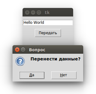
Нажатие «Да» в диалоговом окне возвращает в программу True, «Нет» вернет False (также как закрытие окна через крестик). Таким образом в коде можно обработать выбор пользователя. В данном случае если последний соглашается, то данные переносятся из поля в метку.
Опции title и message являются позиционными, так что можно указывать только значения: .
Подобные окна генерируются при использовании функции askokcancel() с надписями на кнопках «ОК» и «Отмена», askquestion() (возвращает не True или False, а строки ‘yes’ или ‘no’), askretrycancel() («Повторить», «Отмена»), askyesnocancel() («Да», «Нет», «Отмена»).
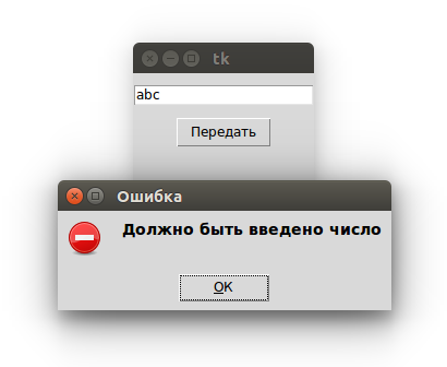
Другую группу составляют окна с одной кнопкой, которые служат для вывода сообщений различного характера. Это showerror(), showinfo() и showwarning().
…
def check():
    s = entry.get()
    if s.isdigit() == False:
        mb.showerror("Ошибка", "Должно быть введено число")
    else:
        entry.delete(, END)
        label'text' = s
…
Методы Text
Основные методы у Text такие же как у Entry – get(), insert(), delete(). Однако, если в случае однострочного текстового поля было достаточно указать один индекс элемента при вставке или удалении, то в случае многострочного надо указывать два – номер строки и номер символа в этой строке (другими словами, номер столбца). При этом нумерация строк начинается с единицы, а столбцов – с нуля.
from tkinter import *

def insertText():
    s = "Hello World"
    text.insert(1.0, s)

def getText():
    s = text.get(1.0, END)
    label'text' = s

def deleteText():
    text.delete(1.0, END)

root = Tk()

text = Text(width=25, height=5)
text.pack()

frame = Frame()
frame.pack()

b_insert = Button(frame, text="Вставить", command=insertText)
b_insert.pack(side=LEFT)

b_get = Button(frame, text="Взять", command=getText)
b_get.pack(side=LEFT)

b_delete = Button(frame, text="Удалить", command=deleteText)
b_delete.pack(side=LEFT)

label = Label()
label.pack()

root.mainloop()
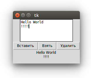
Методы get() и delete() могут принимать не два, а один аргумент. В таком случае будет обрабатываться только один символ в указанной позиции.
Parameters
-
master − This represents the parent window.
-
options − Here is the list of most commonly used options for this widget. These options can be used as key-value pairs separated by commas.
| Sr.No. | Option & Description |
|---|---|
| 1 |
bg The default background color of the text widget. |
| 2 |
bd The width of the border around the text widget. Default is 2 pixels. |
| 3 |
cursor The cursor that will appear when the mouse is over the text widget. |
| 4 |
exportselection Normally, text selected within a text widget is exported to be the selection in the window manager. Set exportselection=0 if you don’t want that behavior. |
| 5 |
font The default font for text inserted into the widget. |
| 6 |
fg The color used for text (and bitmaps) within the widget. You can change the color for tagged regions; this option is just the default. |
| 7 |
height The height of the widget in lines (not pixels!), measured according to the current font size. |
| 8 |
highlightbackground The color of the focus highlight when the text widget does not have focus. |
| 9 |
highlightcolor The color of the focus highlight when the text widget has the focus. |
| 10 |
highlightthickness The thickness of the focus highlight. Default is 1. Set highlightthickness=0 to suppress display of the focus highlight. |
| 11 |
insertbackground The color of the insertion cursor. Default is black. |
| 12 |
insertborderwidth Size of the 3-D border around the insertion cursor. Default is 0. |
| 13 |
insertofftime The number of milliseconds the insertion cursor is off during its blink cycle. Set this option to zero to suppress blinking. Default is 300. |
| 14 |
insertontime The number of milliseconds the insertion cursor is on during its blink cycle. Default is 600. |
| 15 |
insertwidth Width of the insertion cursor (its height is determined by the tallest item in its line). Default is 2 pixels. |
| 16 |
padx The size of the internal padding added to the left and right of the text area. Default is one pixel. |
| 17 |
pady The size of the internal padding added above and below the text area. Default is one pixel. |
| 18 |
relief The 3-D appearance of the text widget. Default is relief=SUNKEN. |
| 19 |
selectbackground The background color to use displaying selected text. |
| 20 |
selectborderwidth The width of the border to use around selected text. |
| 21 |
spacing1 This option specifies how much extra vertical space is put above each line of text. If a line wraps, this space is added only before the first line it occupies on the display. Default is 0. |
| 22 |
spacing2 This option specifies how much extra vertical space to add between displayed lines of text when a logical line wraps. Default is 0. |
| 23 |
spacing3 This option specifies how much extra vertical space is added below each line of text. If a line wraps, this space is added only after the last line it occupies on the display. Default is 0. |
| 24 |
state Normally, text widgets respond to keyboard and mouse events; set state=NORMAL to get this behavior. If you set state=DISABLED, the text widget will not respond, and you won’t be able to modify its contents programmatically either. |
| 25 |
tabs This option controls how tab characters position text. |
| 26 |
width The width of the widget in characters (not pixels!), measured according to the current font size. |
| 27 |
wrap This option controls the display of lines that are too wide. Set wrap=WORD and it will break the line after the last word that will fit. With the default behavior, wrap=CHAR, any line that gets too long will be broken at any character. |
| 28 |
xscrollcommand To make the text widget horizontally scrollable, set this option to the set() method of the horizontal scrollbar. |
| 29 |
yscrollcommand To make the text widget vertically scrollable, set this option to the set() method of the vertical scrollbar. |
5.1. Создание окна приложения
Многие программы на сегодняшний день используют графический интерфейс, который более интуитивен и удобен для пользователя, чем консоль. И с помощью языка программирования Python также можно создавать графические программы. Для этого в Python по умолчанию применяется специальный тулкит — набор компонентов, который называется tkinter.
Тулкит tkinter доступен в виде отдельного встроенного модуля, который содержит все необходимые графические компоненты — кнопки, текстовые поля и т.д.
Базовым моментом в построении графических программ является создание окна. Затем в окно добавляются все остальные компоненты графического интерфейса. Поэтому создадим вначале простейшее окно. Для этого определим следующий скрипт:
from tkinter import *

root = Tk()
'''
any code
'''
root.mainloop()
Для создания графического окна применяется конструктор Tk(), который определен в модуле tkinter. Создаваемое окно присваивается переменной root, и через эту переменную мы можем управлять атрибутами окна.
Вместо комментария „“„any code“„“ добавляются все необходимые компоненты окна.
Для отображения окна надо вызвать у него метод mainloop(), который запускает цикл обработки событий окна для взаимодействия с пользователем.
В результате при запуске скрипта мы увидим такое пустое окошко:
C помощью метода title() можно установить заголовок окна.
С помощью метода geometry() — размер окна. Для установки размера в метод geometry() передается строка в формате «Ширина x Высота». Если при создании окна приложения метод geometry() не вызывается, то окно занимает то пространство, которое необходимо для размещения внутреннего содержимого:
from tkinter import *

root = Tk()
root.title('My first window title')
root.geometry('350x200')
root.mainloop()
Результат выполнения:
Теги
В отличие от идентификаторов, которые являются уникальными для каждого объекта, один и тот же тег может присваиваться разным объектам. Дальнейшее обращение к такому тегу позволит изменить все объекты, в которых он был указан. В примере ниже эллипс и линия содержат один и тот же тег, а функция color изменяет цвет всех объектов с тегом group1
Обратите внимание, что в отличие от имени идентификатора (переменная), имя тега заключается в кавычки (строковое значение)
…
oval = c.create_oval(30,10,130,80,tag="group1")
c.create_line(10,100,450,100,tag="group1")

def color(event):
     c.itemconfig('group1',fill="red",width=3)

c.bind('<Button-3>',color)
…
Метод tag_bind() позволяет привязать событие (например, щелчок кнопкой мыши) к определенной фигуре на Canvas. Таким образом, можно реализовать обращение к различным областям холста с помощью одного и того же события. Пример ниже иллюстрирует, как изменения на холсте зависят от того, где произведен клик.
from tkinter import *

c = Canvas(width=460, height=100, bg='grey80')
c.pack()

oval = c.create_oval(30, 10, 130, 80, fill="orange")
c.create_rectangle(180, 10, 280, 80,
                    tag="rect", fill="lightgreen")
trian = c.create_polygon(330, 80, 380, 10, 430, 80,
                    fill='white',outline="black")

def oval_func(event):
     c.delete(oval)
     c.create_text(80, 50, text="Круг")
def rect_func(event):
     c.delete("rect")
     c.create_text(230, 50, text="Прямоугольник")
def triangle(event):
     c.delete(trian)
     c.create_text(380, 50, text="Треугольник")

c.tag_bind(oval, '<Button-1>', oval_func)
c.tag_bind("rect", '<Button-1>', rect_func)
c.tag_bind(trian, '<Button-1>', triangle)

mainloop()
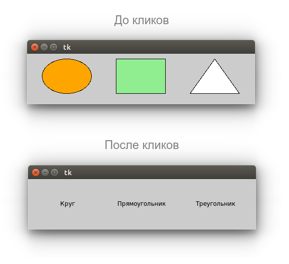
Метод delete() удаляет объект. Если нужно очистить холст, то вместо идентификаторов или тегов используется константа ALL.
5.4. Параметры виджетов
Всего же конструктор Button может принимать следующие параметры:
Button(master, options)
Параметр master представляет ссылку на родительский контейнер. В случае выше это могло бы быть само графическое окно, и мы могли написать:
root = Tk()
root.title("GUI на Python")
root.geometry("300x250")
btn = Button(root, text="Hello")
btn.pack()
Однако если в коде создается одно окно, то кнопка и любой другой элемент уже по умолчанию размещаются в этом окне. Поэтому первый параметр мы можем опустить, как в примерах выше. Если бы у нас в коде создавалось бы несколько окон, тогда мы могли бы передать в конструктор Button ссылку на нужное окно.
Второй параметр options представляет набор на самом деле набор параметров, которые мы можем установить по их имени:
- activebackground: цвет элемента, когда он находится в нажатом состоянии
- activeforeground: цвет текста элемента, когда он в нажатом состоянии
- bd: толщина границы (по умолчанию 2)
- bg/background: фоновый цвет
- fg/foreground: цвет текста
- font: шрифт текста, например, font=»Arial 14» — шрифт Arial высотой 14px, или font=(«Verdana», 13, «bold») — шрифт Verdana высотой 13px с выделением жирным
- height: высота элемента
- highlightcolor: цвет элемента, когда она в фокусе
- image: изображение на элементе
- justify: устанавливает выравнивание текста. Значение LEFT выравнивает текст по левому краю, CENTER — по центру, RIGHT — по правому краю
- padx: отступ от границ элемента до ее текста справа и слева
- pady: отступ от границ элемента до ее текста сверху и снизу
- relief: определяет тип границы, может принимать значения SUNKEN, RAISED, GROOVE, RIDGE
- state: устанавливает состояние элемента, может принимать значения DISABLED, ACTIVE, NORMAL (по умолчанию)
- text: устанавливает текст элемента
- textvariable: устанавливает привязку к элементу StringVar
- underline: указывает на номер символа в тексте элемента, который подчеркивается. По умолчанию значение -1, то есть никакой символ не подчеркивается
- width: ширина элемента
- wraplength: при положительном значении строки текста будут переносится для вмещения в пространство элемента
Если мы создадим две радиокнопки без соответствующих настроек, то обе они будут включены и выключить их будет невозможно:
Эти переключатели никак не связаны друг с другом. Кроме того для них не указано исходное значение, должны ли они быть в состоянии «вкл» или «выкл». По-умолчанию они включены.
Связь устанавливается через общую переменную, разные значения которой соответствуют включению разных радиокнопок группы. У всех кнопок одной группы свойство variable устанавливается в одно и то же значение – связанную с группой переменную. А свойству value присваиваются разные значения этой переменной.
В Tkinter нельзя использовать любую переменную для хранения состояний виджетов. Для этих целей предусмотрены специальные классы-переменные пакета tkinter – BooleanVar, IntVar, DoubleVar, StringVar. Первый класс позволяет принимать своим экземплярам только булевы значения (0 или 1 и True или False), второй – целые, третий – дробные, четвертый – строковые.
r_var = BooleanVar()
r_var.set()
r1 = Radiobutton(text='First', variable=r_var, value=)
r2 = Radiobutton(text='Second', variable=r_var, value=1)
Здесь переменной r_var присваивается объект типа BooleanVar. С помощью метода set() он устанавливается в значение 0.
При запуске программы включенной окажется первая радиокнопка, так как значение ее опции value совпадает с текущим значением переменной r_var. Если кликнуть по второй радиокнопке, то она включится, а первая выключится. При этом значение r_var станет равным 1.
В программном коде обычно требуется «снять» данные о том, какая из двух кнопок включена. Делается это с помощью метода get() экземпляров переменных Tkinter.
from tkinter import *

def change():
    if var.get() == :
        label'bg' = 'red'
    elif var.get() == 1:
        label'bg' = 'green'
    elif var.get() == 2:
        label'bg' = 'blue'

root = Tk()

var = IntVar()
var.set()
red = Radiobutton(text="Red", variable=var, value=)
green = Radiobutton(text="Green", variable=var, value=1)
blue = Radiobutton(text="Blue", variable=var, value=2)
button = Button(text="Изменить", command=change)
label = Label(width=20, height=10)
red.pack()
green.pack()
blue.pack()
button.pack()
label.pack()

root.mainloop()
В функции change() в зависимости от считанного значения переменной ход выполнения программы идет по одной из трех веток.
Вставка виджетов в текстовое поле
В Text можно вставлять другие виджеты помощью метода window_create(). Потребность в этом не велика, однако может быть интересна с объектами типа Canvas. Данный класс будет изучен позже. В примере ниже вставляется метка в текущую (INSERT) позицию курсора.
from tkinter import *

def smile():
    label = Label(text=":)", bg="yellow")
    text.window_create(INSERT, window=label)

root = Tk()

text = Text(width=50, height=10)
text.pack()

button = Button(text=":)", command=smile)
button.pack()

root.mainloop()
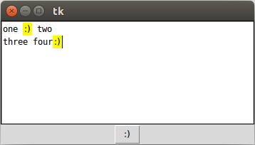
Размещение метки в функции позволяет каждый раз при вызове функции создавать новую метку. Иначе, если бы метка была в основной ветке программы, предыдущая исчезала бы.
GUI Design Tools and IDEs
|
IDE |
Target |
Latest version |
Latest update date |
Notes |
|
0.6.1 |
2007-07-05 |
GPL A RAD GUI Building IDE for wxPython. See BoaConstructor |
||
|
5.4.2 |
2014-03-09 |
GPL. a full featured Python and Ruby editor and IDE, integrating the highly flexible Scintilla editor control.(Python 2 & 3 versions) |
||
|
Visual GUI Designer, Inspector and Property Editor (embeddable). PythonCard «fork». LGPL3. |
||||
|
3.16.1 |
2013-12-18 |
GPL. Glade is a RAD tool to enable quick & easy development of user interfaces for the GTK+ toolkit and the GNOME desktop environment. |
||
|
Commercial |
||||
|
MacOSX, Win, Linux |
3.0.38 |
2014-01-24 |
App to creating 2D visuals using Python programming code. |
|
|
TkInter, Tix |
4.2.1 |
2014-02-21 |
GUI editor for Windows, Mac and Linux. |
|
|
0.9.2 |
2013-11-05 |
GPL TkInter GUI builder (exports XML «.ui» files) and RAD tool inspired by Glade. |
||
|
Windows |
2.5.1 |
20120319 |
MIT Open Source IDE developed using Python and Delphi. See PyScripter.(Python 2 & 3) |
|
|
Windows/Linux/Mac |
13.01 |
2013-03-07 |
An interactive environment for python, suitable for interactive GUI programming with different GUI toolkits (wxPython, TkInter, pyGTK, pyQT4 and PySide) |
|
|
gui2py & wxPython |
Rapid Application Development platform for python (including editor, debugger, visual designer, unit tests, etc.). GPLv3. Alpha. |
|||
|
A form design tool, available with both Commercial and GPL editions of Qt. Can be used with Eric3 and Eric4. |
||||
|
3.9.0 |
2018/10/26 |
GPL cross-platform WYSIWYG GUI builder. Can produce XRC/XML, wxWidgets/C++, or wxPython/python. |
||
|
0.9.2 |
2019-03-07 |
MIT License, wxGlade is a GUI designer written in Python with the popular GUI toolkit wxPython, that helps you create wxWidgets/wxPython user interfaces.. See WxGlade supports Python 2.7 & >=3.4 + wxPython >=2.8 or >=4.0 |
||
|
1.28 |
2010-04-18 |
Visual Tkinter IDE for Python 2.6 |
||
|
0.12.2554 |
2010-11-02 |
Visual Python IDE for Python 2.6 |
Methods
Following are commonly used methods for this widget −
| Sr.No. | Method & Description |
|---|---|
| 1 |
delete ( first, last=None ) Deletes characters from the widget, starting with the one at index first, up to but not including the character at position last. If the second argument is omitted, only the single character at position first is deleted. |
| 2 |
get() Returns the entry’s current text as a string. |
| 3 |
icursor ( index ) Set the insertion cursor just before the character at the given index. |
| 4 |
index ( index ) Shift the contents of the entry so that the character at the given index is the leftmost visible character. Has no effect if the text fits entirely within the entry. |
| 5 |
insert ( index, s ) Inserts string s before the character at the given index. |
| 6 |
select_adjust ( index ) This method is used to make sure that the selection includes the character at the specified index. |
| 7 |
select_clear() Clears the selection. If there isn’t currently a selection, has no effect. |
| 8 |
select_from ( index ) Sets the ANCHOR index position to the character selected by index, and selects that character. |
| 9 |
select_present() If there is a selection, returns true, else returns false. |
| 10 |
select_range ( start, end ) Sets the selection under program control. Selects the text starting at the start index, up to but not including the character at the end index. The start position must be before the end position. |
| 11 |
select_to ( index ) Selects all the text from the ANCHOR position up to but not including the character at the given index. |
| 12 |
xview ( index ) This method is useful in linking the Entry widget to a horizontal scrollbar. |
| 13 |
xview_scroll ( number, what ) Used to scroll the entry horizontally. The what argument must be either UNITS, to scroll by character widths, or PAGES, to scroll by chunks the size of the entry widget. The number is positive to scroll left to right, negative to scroll right to left. |
Geometry Management
All Tkinter widgets have access to specific geometry management methods, which have the purpose of organizing widgets throughout the parent widget area. Tkinter exposes the following geometry manager classes: pack, grid, and place.
-
The pack() Method − This geometry manager organizes widgets in blocks before placing them in the parent widget.
-
The grid() Method − This geometry manager organizes widgets in a table-like structure in the parent widget.
-
The place() Method − This geometry manager organizes widgets by placing them in a specific position in the parent widget.
Let us study the geometry management methods briefly −
Previous Page
Print Page
Next Page
PyGTK
Проект PyGTK – это ещё один мульти-платформенный GUI инструмент, использующий библиотеки GTK+. В
листинге 3 показан пример PyGTK-приложения (файл hw3gtk.py в архиве
python_gui.tgz ), демонстрирующий что PyGTK также полагается на событийно-управляемый
подход.
Листинг 3. Пример PyGTK-приложения
#!/usr/bin/env python
#-*- coding: UTF-8 -*-

import gtk

def button_clicked(button):
    print 'Hello World!'

def main():
    window = gtk.Window()
    window.set_default_size(240, 180)
    window.set_title('Hello World!')
    window.connect('destroy', lambda w: gtk.main_quit())

    button = gtk.Button('Press Me')
    button.connect('clicked', button_clicked)
    button.show()

    window.add(button)
    window.present()

    gtk.main()

if __name__ == '__main__':
    main()
На рисунке 3 показан результат запуска этого примера.
В разделе «Ресурсы» приведены ссылки на подробную документацию по PyGTK, в том числе и на
русскоязычные материалы.
Начиная с 2012 года (с версии 2.8), обёртки объектов Glib были вынесены в отдельную библиотеку —
PyGObject, которая должна будет полностью вытеснить PyGTK при использовании GTK+ версии 3:
$ aptitude search python3-gi
p   python3-gi       - Python 3 bindings for gobject-introspection libraries
p   python3-gi-cairo - Python 3 Cairo bindings for the GObject library
p   python3-gi-dbg   - Python 3 bindings for gobject-introspection libraries (debug ...
После установки пакета можно воспроизвести
предыдущий пример, но уже с использованием Python 3. В листинге 4 показан обновлённый вариант кода (см.
файл hw4gtk.py из архива python_gui.tgz). В данном случае изменения носят
скорее косметический характер, хотя иногда в ходе миграции из PyGTK в PyGObject могут возникнуть
определённые проблемы.
Листинг 4. Пример PyGTK-приложения для Python 3
#!/usr/bin/python3
#-*- coding: UTF-8 -*-

from gi.repository import Gtk

def button_clicked(button):
    print( 'Hello World!' )

def main():
    window = Gtk.Window()
    window.set_default_size(240, 180)
    window.set_title('Hello World!')
    window.connect('destroy', lambda w: Gtk.main_quit())

    button = Gtk.Button('Press Me')
    button.connect('clicked', button_clicked)
    button.show()

    window.add(button)
    window.present()

   Gtk.main()

if __name__ == '__main__':
    main()
Исполнение этого примера в Python 3 создаст аналогичное окно.
$ python3 hw4gtk.py
Hello World!
Hello World!
Hello World!
...
Заключение
В этой и предыдущей статьях был представлен обзор некоторых инструментов для Python, которые можно
использовать для создания графических приложений. Также были сформулировали и показаны на примерах
общие принципы построения GUI-приложений (схема событийно управляемых приложений), которые постоянны и
независят от библиотеки, выбранной для отображения виджетов.
На практике были рассмотрены примеры кода, использующие различные технологии для создания
GUI-интерфейсов к приложениям на языке Python. Надо понимать, что показанные в обзоре инструменты — это
далеко не все возможности, доступные в Python для создания GUI-приложений. Существует ещё ряд
независимых проектов, которые не упоминались в этих двух статьях.
Но независимо от используемого инструмента, логика и структура таких приложений будут строиться вокруг
обработки событий пользовательского интерфейса. А различные инструменты будут обладать специфическими
возможностями, например поддержкой 2D и 3D-графики, анимации или мультимедиа форматов, которые и
помогут выбрать инструмент, подходящий для решения конкретной задачи.
Похожие темы
- Тонкости использования языка Python: Часть 9. Разработка GUI-приложений.
- wxPython
- WxPython in Action (перевод)
- Albert Sweigart, «Invent You Own Computer Games with Python»
- Albert Sweigart, «Making Games with Python & Pygames»
- Zenity — графический интерфейс для командной строки
- PyZenity
- Play with GUIs using Python
